Overview
JelphaBot is a desktop application that serves as a simple yet comprehensive task manager for NUS students. Interactions with the application and commands are entered through CLI. For a better user experience, JavaFX was used to create and enhance the GUI. It is writtren in Java, and has about 13 kLoC.
Summary of contributions
-
Major enhancement: added the ability for users to have a summary view of their tasks due and completed within the day.
-
What it does: allows the user to have a simplified view of all the tasks that are due to be completed within the day, as well as the tasks that the user have completed within the day, under one page. This page is shown upon the startup of the application, and can be accessed anytime while using the app by entering the
summarycommand. -
Justification: In the event the user wishes to have a quick look at what tasks he/she has remaining to complete within the day, or to see what tasks he/she has completed within the day, the user can easily do so and view this information all under the same page, with just a single command. This feature improves the product significantly with the convenience that it provides to the user in obtaining a quick but comprehensive overview of the above-mentioned tasks.
-
Highlights:
-
This enhancement works with existing commands and commands to be added in future. It required an in-depth analysis of design alternatives so as to determine the optimal layout of the UI of the Summary panel to enhance the user experience as much as possible.
-
The implementation too was challenging as it required the creation of special predicates to filter the tasks in the user’s task list to be displayed, as well as deciding on what information from the tasks to display to the users. Eventually, I decided to display only the Module Code and the Description of the task.
-
Another challenge during the implementation was ensuring that the tasks that were completed within the day were still displayed when the user exits the application, and starts it again within the same day. This required extra data to be stored and hence required modification of classes in
Storageto ensure that the data was stored correctly.
-
-
Credits: The structure and the classes in the summary package (under
Model) were inspired by that of the productivity package, which is underModelas well.
-
-
Minor enhancement: added a
donecommand that allows the user to mark a task with the given index as completed.-
Relevant pull requests: #71
-
-
Code contributed: Functional Code Test Code
Other contributions:
-
Issues management:
-
Enhancements to existing features:
-
Updated and shifted task list filtering logic in relevant Model and Logic classes and APIs so as to not break abstraction between the classes and roles of the classes. #170
-
-
Documentation:
-
Replaced the Model class diagrams of the User Guide to make them the consistent with the structure of JelphaBot: #189
-
Added documentation for SummaryCommand, ShowCompletedCommand and ShowIncompleteCommand in User Guide: #189
-
Added documentation and sequence diagrams for SummaryCommand to Developer Guide: #294, #336
-
Added Use Cases UC4 to UC6: #58
-
-
Community:
Contributions to the User Guide
Given below are sections I contributed to the User Guide. They showcase my ability to write documentation targeting end-users. |
Summary (Eden)
This will be the first panel you see after entering JelphaBot!
This section gives you a minimalistic overview of the day, namely tasks that you have due within the day, and tasks that you have completed within the day. Tasks displayed will only have it’s module code as well as their description for simplicity!
Viewing the summary tab: summary
You can enter the summary command or its shortcuts :S or :s to manually switch to the summary tab.
Summary panel shows your tasks that are due today, and those that you have completed today.
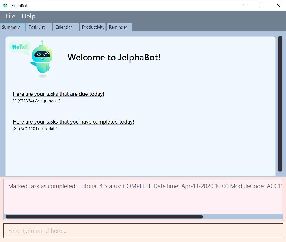
Once a task that is due today is marked as done, it will appear under the tasks that you have completed today.
Format: summary
Shortcut: :S or :s
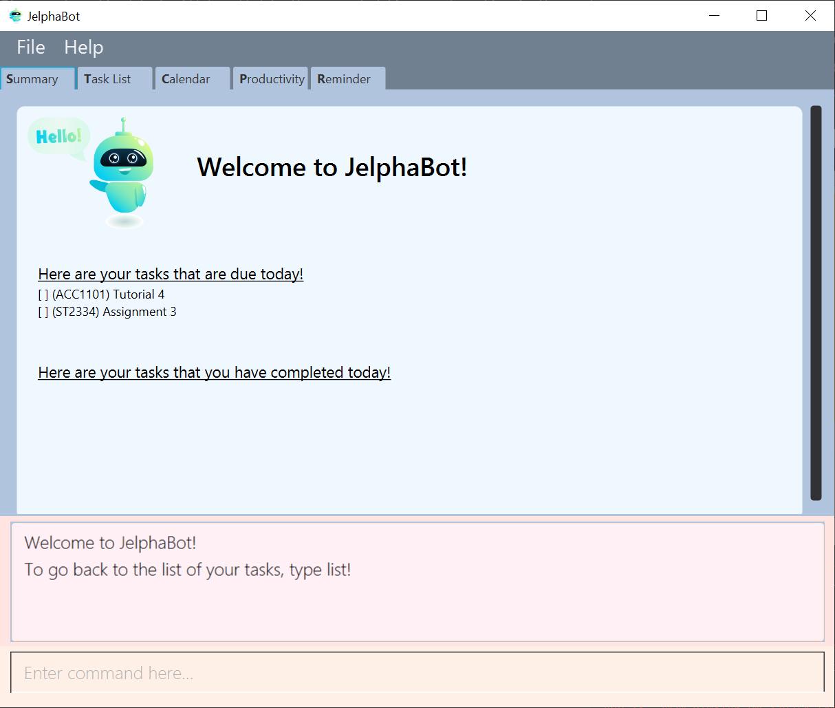
summarySummary panel shows the tasks that are Due Today, and Completed Today.
Once a task under the Due Today header is marked as done, it will appear under the Completed Today tab.
Showing completed Tasks : show-completed (Eden)
You can keep a log of all the tasks that have been completed with the show-completed command.
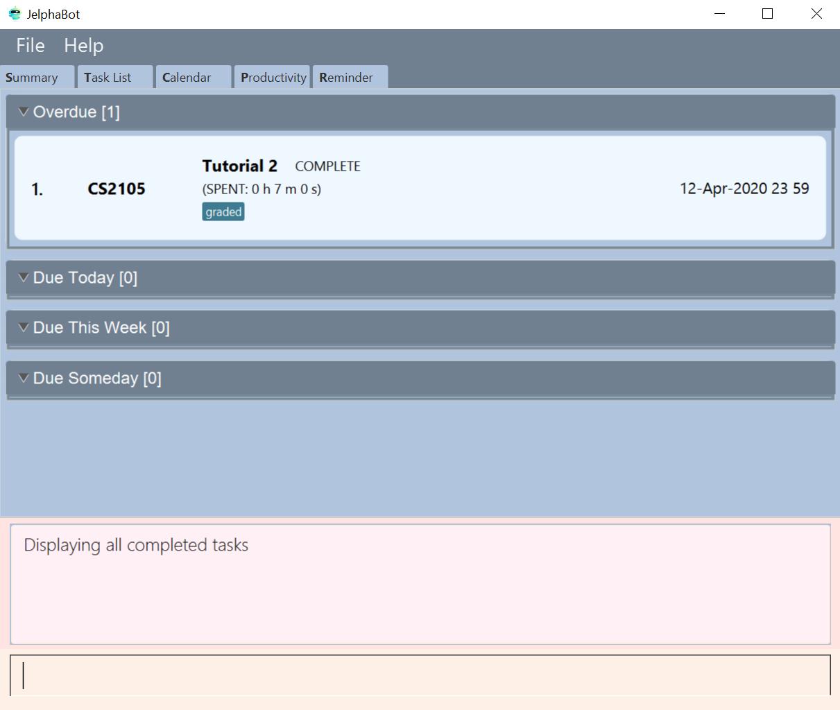
show-completedThe figure above shows a task list with a single task completed.
If you do not have any currently complete tasks, the displayed list will be empty and a message will be shown telling you that you currently do not have any completed tasks!
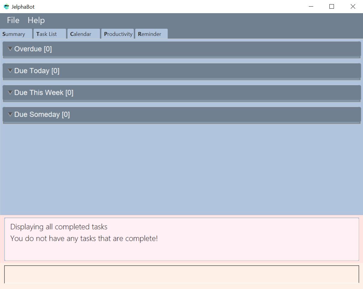
show-completed, if the task list does not have any completed tasksShowing incomplete Tasks: show-incomplete (Eden)
You can display all the tasks in your task list that are currently incomplete, so that you can see what you should do next.
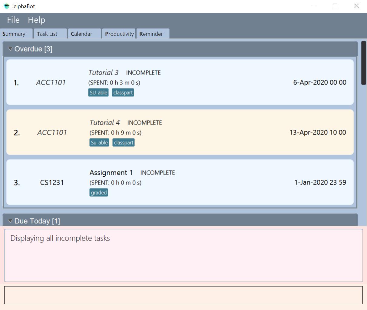
show-incompleteIn the example above, there are many overdue tasks. The task list can be further scrolled to view all the tasks.
If you do not have any tasks that are incomplete in your task list, the displayed list will be empty and a message will be shown telling you that you currently do not have any incomplete tasks!
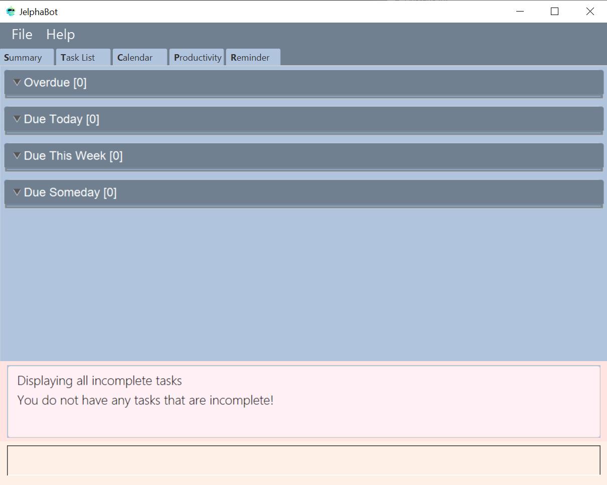
show-incomplete, if the task list does not have any incomplete tasksThe corresponding message is shown in the Results Display. == Contributions to the Developer Guide
Given below are sections I contributed to the Developer Guide. They showcase my ability to write technical documentation and the technical depth of my contributions to the project. |
Summary feature (Eden)
JelphaBot has a Summary feature which provides an overview of the tasks due within the day as well as all tasks that have been complete within the day.
This feature comes in the form of a summary panel, which comprises of two sections for the tasks due within the day and the tasks completed within the day respectively.
For each task shown only details such as the Module Code and the Description are shown.
Once the user marks a task due within the day as complete, it will automatically appear under the tasks completed within the day.
| If the user marks a task as completed, and immediately deletes the task from the task list, it will not appear in the summary screen. |
Implementation
The implementation of this panel is facilitated by the summary package.
Upon creation, the Summary object obtains the main task list from Model.
The task list is then filtered with the help of TaskDueWithinDayAndIncompletePredicate and TaskCompletedWithinDayPredicate to obtain two lists with the desired tasks.
These lists are stored as fields in the Summary class and are used to display the relevant information in the summary panel.
The following class diagram shows the structure of the classes in the summary package, in relation with their Ui counterparts.
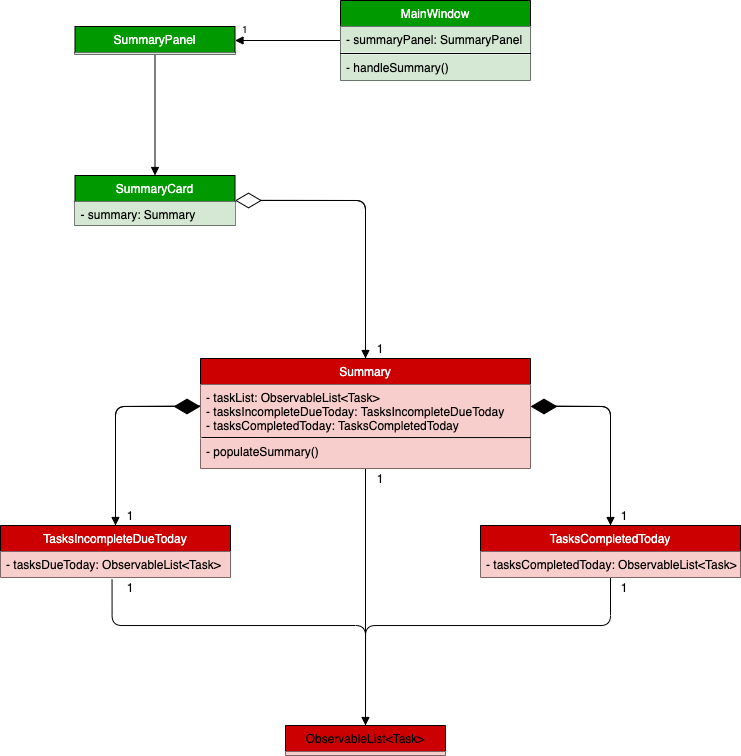
Summary, SummaryPanel and their components.To view the respective tasks, the user enters the summary command.
Upon entry of the summary command, a SummaryCommand object will be created and SummaryCommand#execute()
will be called.
The following sequence diagram details the execution when SummaryCommand#execute() is called.
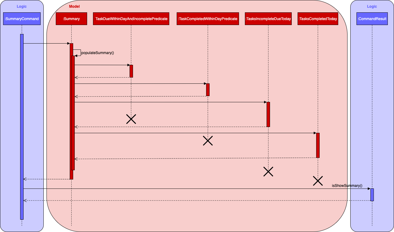
Summary object when SummaryCommand#execute() is executed.Design considerations
Aspect 1: The summary panel depends on the creation of new Summary objects to be updated
-
Current solution: Each time
DoneCommandis executed, a new Summary object is to be created, and along with it the task lists contained inside theSummaryobject is updated and displayed on the summary panel as an updated list.-
Pros: Easy to implement. Scalable when there are more things to be displayed on the summary panel.
-
Cons: Consecutive done commands are expensive, as the lists in the
Summaryobject are reinitialised upon every done command.
-
-
Alternative 1: Have a single
Summaryobject with underlying task list listeners to update the relevant task lists-
Pros: Only one
Summaryobject will have to be created for the duration the application is open. The task lists in theSummaryobject do not have to be reinitialised upon every done command. -
Cons: May not be scalable if there are many things to be added to the summary panel in the future, as this will require more listeners, and the presence of many listeners may affect the performance of the application.
-
-
Reason for chosen implementation: The current implementation is more straightforward and simpler to implement, as the
SummaryListandSummaryPanelwhich are used to display the contents of the summary panel simply need to extract and display the contents of theSummaryobject that was given, instead of requiring underlying listeners to keep track of whatever is happening within the application.
Aspect 2: Summary panel aesthetic improvements
-
Current solution: The Welcome header, tasks due today and tasks completed subsections have the same font and styling. The distinction between them is by the bigger font for the Welcome header, and the space separation between the subsections. This is done by having each section in their own separate
Vbox. Everything shown on the panel is shown as plain text, with no additional styling.-
Pros: This gives the summary panel a minimal look that is simple and easy to look at, while still providing the user with the relevant information that is needed.
-
Cons: Due to the implementation of the subsections as separate boxes of equal sizes that are scaled to fit the panel, there is a lot of unused space in between each subsection, if there are not enough tasks to fill in the space. This can be seen as a waste of space.
-
-
Alternative 1: Add font styling and section highlighting to different sections of the summary panel
-
Pros: Makes the summary panel more visually appealing, and makes each subsection more distinct from each other.
-
Cons: Does not solve the problem of unused space when there are not enough tasks to fill the space in each subsection.
-
-
Reason for chosen implementation: The current implementation is easier to implement and keeps the summary panel simple and easy to look at as it avoids the cluttering of the summary panel with too many different design elements. This makes it very user-friendly, and it also easily scalable in the future as each section is already partitioned accordingly, so future changes to the summary panel simply have to change the elements within each section.